library(dplyr)
library(readr)
library(ggplot2)
library(ggfortify)

## theme for ggplot
theme_set(theme_classic())
theme_update(text = element_text(size = 14))Solution to the population growth exercise
Data source:
Hannah Ritchie, Lucas Rodés-Guirao, Edouard Mathieu, Marcel Gerber, Esteban Ortiz-Ospina, Joe Hasell and Max Roser (2023) - “Population Growth”. Published online at OurWorldInData.org. Retrieved from: https://ourworldindata.org/population-growth [Online Resource]
1 Load packages
2 Load data
df <- read_csv("data/07_population-and-demography.csv")
df
# A tibble: 18,288 × 24
`Country name` Year Population Population of childr…¹ Population of childr…²
<chr> <dbl> <dbl> <dbl> <dbl>
1 Afghanistan 1950 7480464 301735 1248282
2 Afghanistan 1951 7571542 299368 1246857
3 Afghanistan 1952 7667534 305393 1248220
4 Afghanistan 1953 7764549 311574 1254725
5 Afghanistan 1954 7864289 317584 1267817
6 Afghanistan 1955 7971933 323910 1291129
7 Afghanistan 1956 8087730 330888 1322342
8 Afghanistan 1957 8210207 337874 1354752
9 Afghanistan 1958 8333827 344796 1387274
10 Afghanistan 1959 8468220 352235 1421808
# ℹ 18,278 more rows
# ℹ abbreviated names: ¹`Population of children under the age of 1`,
# ²`Population of children under the age of 5`
# ℹ 19 more variables: `Population of children under the age of 15` <dbl>,
# `Population under the age of 25` <dbl>,
# `Population aged 15 to 64 years` <dbl>,
# `Population older than 15 years` <dbl>, …3 Calculate world population
df_world <- summarise(df, Population = sum(Population), .by = Year)
df_world
# A tibble: 72 × 2
Year Population
<dbl> <dbl>
1 1950 15450675880
2 1951 15731647959
3 1952 16033936161
4 1953 16354360176
5 1954 16685947167
6 1955 17033211987
7 1956 17386864191
8 1957 17753428483
9 1958 18128530668
10 1959 18480719829
# ℹ 62 more rows4 Visualize data
ggplot(df_world, aes(Year, Population)) +
    geom_line() +
    geom_point()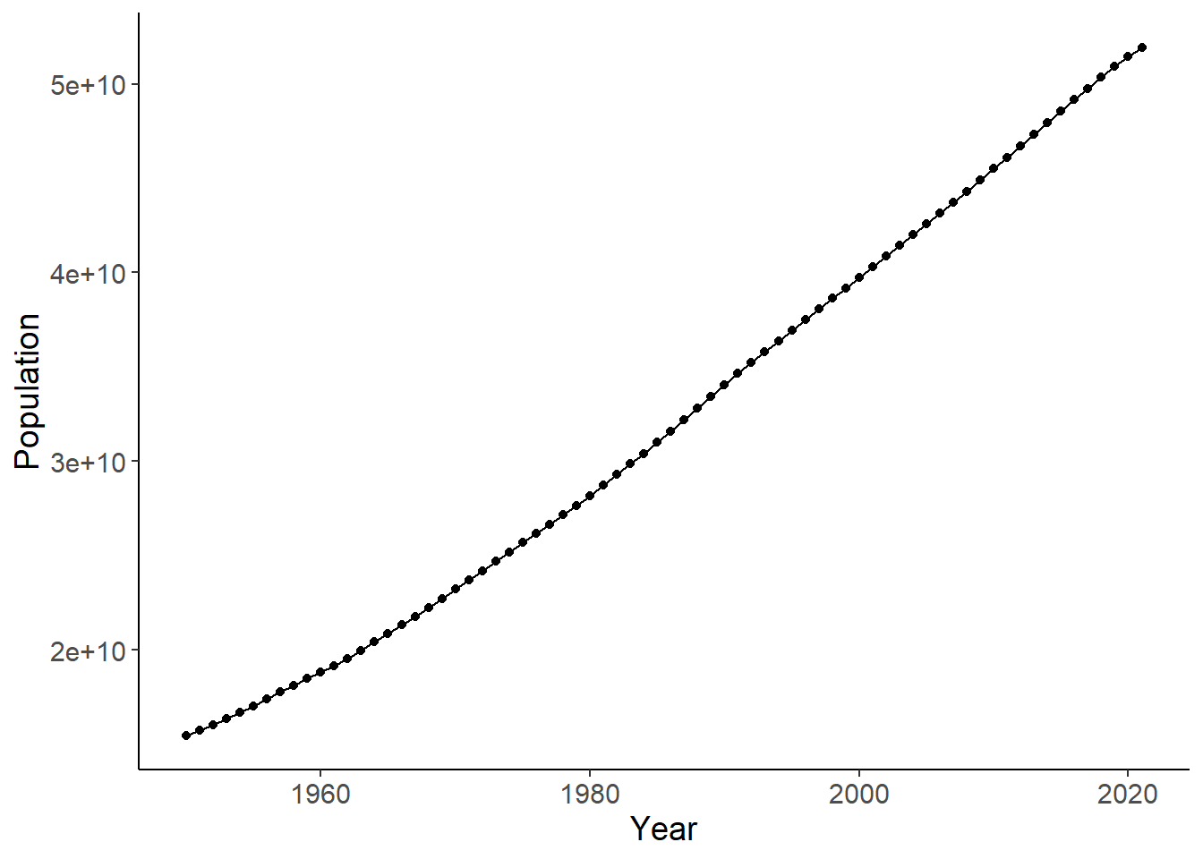
5 Check if linear or an exponential model fits better
lm1 <- lm(Population ~ Year, data = df_world)
autoplot(lm1, which = 1:2)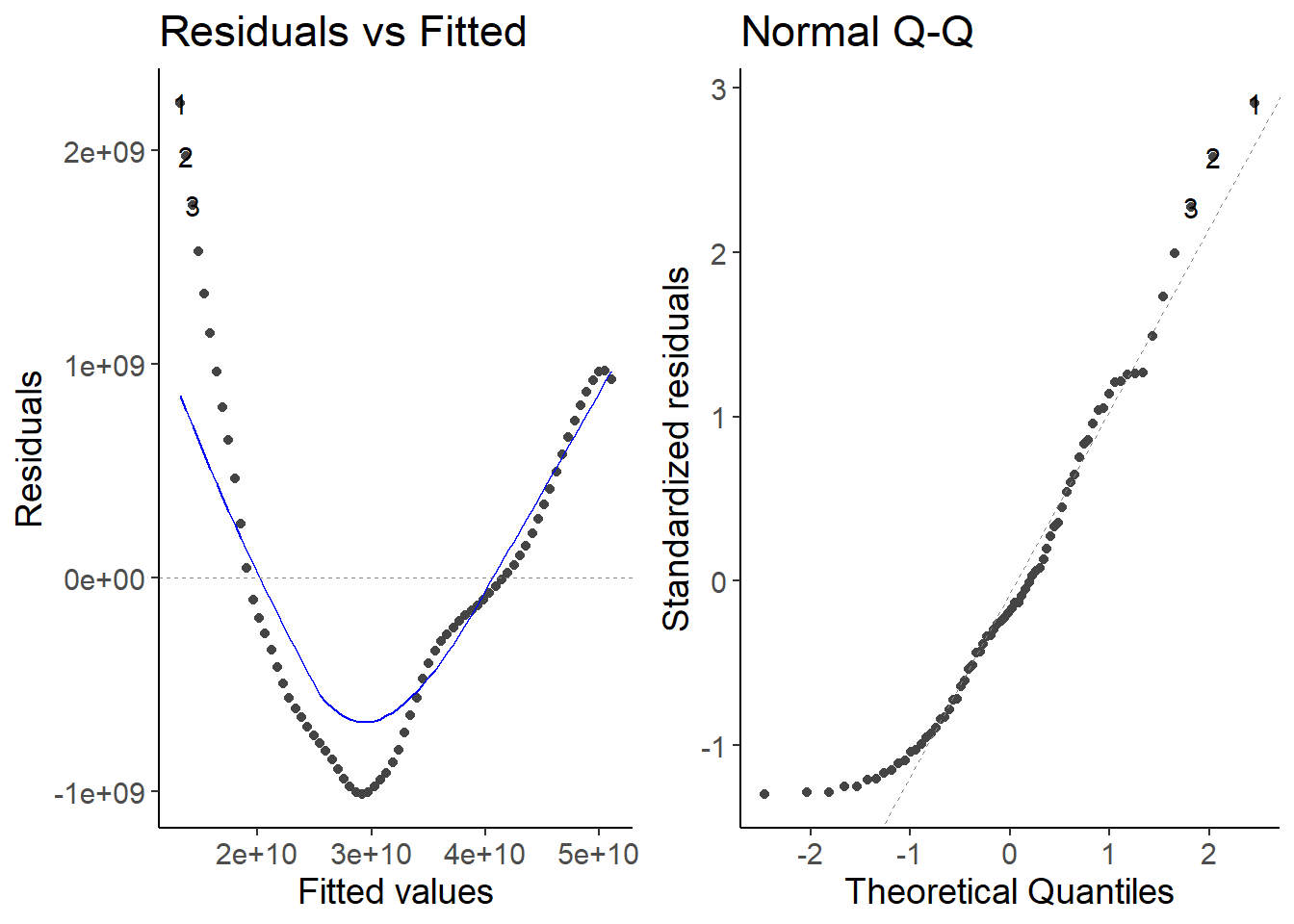
lm2 <- lm(log(Population) ~ Year, data = df_world)
autoplot(lm2, which = 1:2)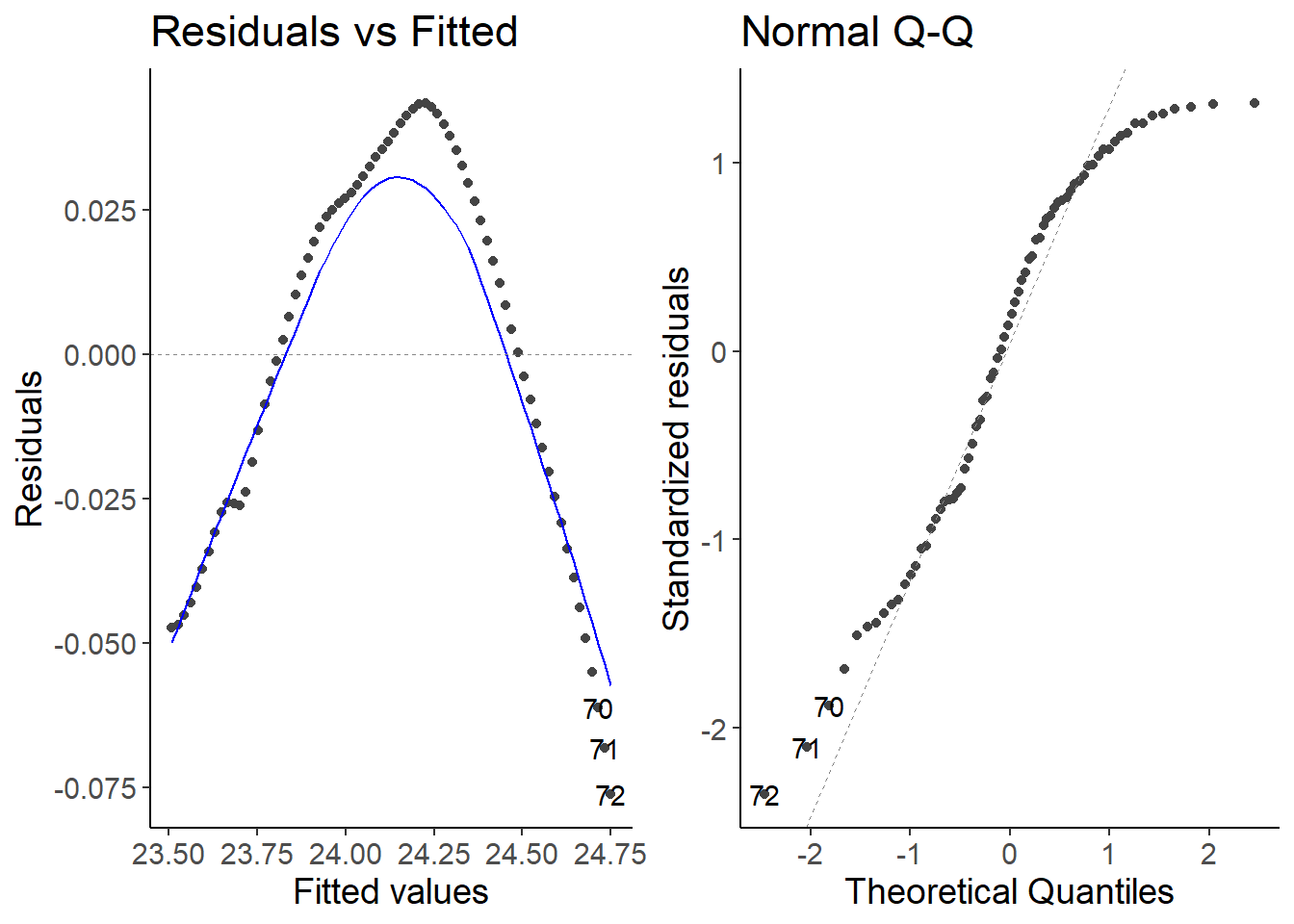
Explanation
Both models do not fit well to the data. The growth is not constant over time.
6 Calculate the growth rate and visualize it
df_world <- mutate(df_world, growth_rate = Population / lag(Population))

ggplot(df_world, aes(Year, growth_rate)) +
    geom_line() +
    geom_point() +
    labs(y = "Growth rate")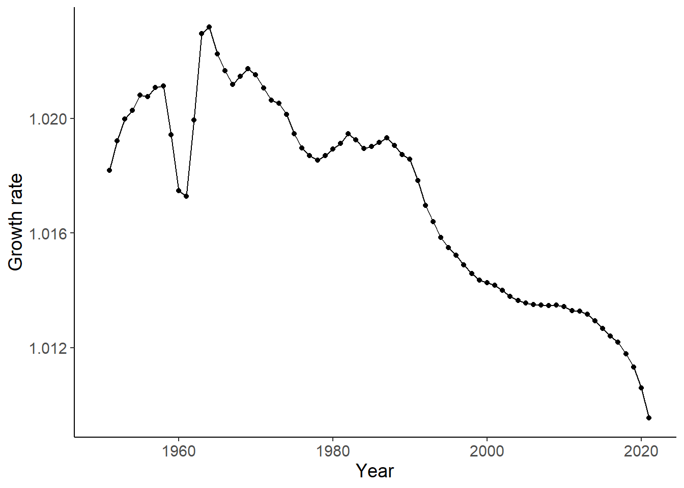
Link
see also here of the Our World in Data project.
7 Complete script
library(dplyr)
library(readr)
library(ggplot2)
library(ggfortify)

## theme for ggplot
theme_set(theme_classic())
theme_update(text = element_text(size = 14))

## Load data
df <- read_csv("data/07_population-and-demography.csv")

## Calculate world population and visualize data
df_world <- summarise(df, Population = sum(Population), .by = Year)

ggplot(df_world, aes(Year, Population)) +
    geom_line() +
    geom_point()

## Check if linear or an exponential model fits better
lm1 <- lm(Population ~ Year, data = df_world)
autoplot(lm1, which = 1:2)

lm2 <- lm(log(Population) ~ Year, data = df_world)
autoplot(lm2, which = 1:2)

## Calculate the growth rate and visualize it
df_world <- mutate(df_world, growth_rate = Population / lag(Population))

ggplot(df_world, aes(Year, growth_rate)) +
    geom_line() +
    geom_point() +
    labs(y = "Growth rate")