penguin_cols <- c("darkorange", "purple", "cyan4")Course Introduction
1 Lecture
1.1 Tibbles
1.2 Figures with ggplot2
1.3 Data handling
2 Tasks
2.1 ggplot2
A helpful resource to consult for this task can be the ggplot2 cheatsheet.
Remember to put library(tidyverse) (or library(ggplot2)) on top of your script to access the ggplot functions.
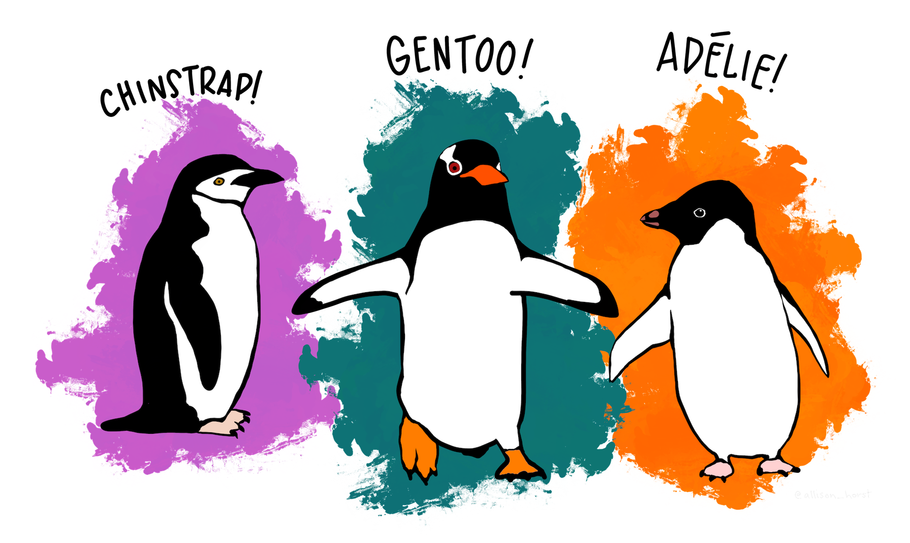
To practice plotting with the ggplot2 package, we will use a data set on 3 species of penguins on islands in Antarctica.
The data is available from the palmerpenguins package. To get it, you have to:
- Install the package with
install.packages("palmerpenguins") - Load the package at the beginning of your script with
library(palmerpenguins)
The data set is called penguins:
- The data set is available after you loaded the package
- Just type
penguinsin the console and you should see thepenguinstibble - Find a description of the variables in the help page
?penguins
Take a moment to get familiar with the data set and its variables.
2.2 Exploratory plots with ggplot 2
Explore the data set and it’s variables with ggplot. Below, you find some suggestions for plots. You can start with the plot type your are most interested in and then continue from there. You don’t have to finish all the plots If you have your own ideas for interesting plots with the penguin data set, feel free to deviate from the tasks.
In this exploratory section, don’t worry about the beauty of your plots. This task is about exploring the data and testing different visualization options.
2.2.1 Relationship between bill length and bill depth (scatterplot)
What is the relationship between bill length and bill depth?
- Create a scatterplot with bill length on the x-axis and bill depth on the y-axis
- Can you add a regression line?
- Add species as color aesthetic. Does your interpretation of the data change?
- What is the difference between adding color as a global aesthetic or as a local aesthetic of the point layer?
- Add species as shape aesthetic to distinguish the species
2.2.2 Difference in flipper length between species (boxplot)
Is there a difference in flipper length between the species?
- Create a boxplot of the flipper length (y-axis) for the different species (x-axis)
- Try adding notches to the boxplots
- Extra: Add a layer with
geom_point(). Try settingposition = position_jitter()as argument in the point layer. What does it do?
2.2.3 Differences between body mass of male and female penguins (boxplot)
Are male penguins heavier than female penguins? And is this different between the 3 species?
- Create a boxplot with body mass on the y axis and sex on the x axis
- Add the difference between penguin species to this plot. Try the different options ggplot offers
- Species as color aesthetic
- Species as fill aesthetic
- Species as facet using
facet_wrap
- Extra: What happens if you use
geom_violininstead ofgeom_boxplot? Can you combine both geoms in one plot?
2.2.4 Distribution of flipper length between species (histogram)
Make a histogram of the the flipper length separated by species.
Try different methods of separating the species (color or facet).
Compare stacked and overlapping histograms.
2.2.5 Penguin flipper length by species and sex (heatmap)
Create a heat map that shows:
- The categories sex and species on x- and y-axis
- The flipper length as color
2.2.6 Beautify the plots
First, choose one of the tasks 2.2.7 or 2.2.8, then do task 2.2.9 on saving plots. If you still have time, you can come back to the task you didn’t do.
But also here, if you have other ideas, feel free to deviate from the tasks.
2.2.7 Beautify the plots from Task 1
Take a plot you did in the previous task and make it look nicer.
Here’s a list of ideas:
- Add a theme layer
- Customize the theme, e.g.
- Change the position of the legend
- Make the axis titles bold
- Change the color/fill scale of the plot
- Use
scale_color_manualorscale_fill_manual - Try
scale_color_viridis_d()orscale_fill_viridis_d()with different options - Try a color scale from the
paletteerpackage- First you have to install the package, then have a look at the available palettes
- Use
- Change the labels of the x- and y-axis and add a title to the plot
- Make the points transparent, give them a different shape, …
2.2.8 Can you reproduce this plot?
Take a look at this plot:
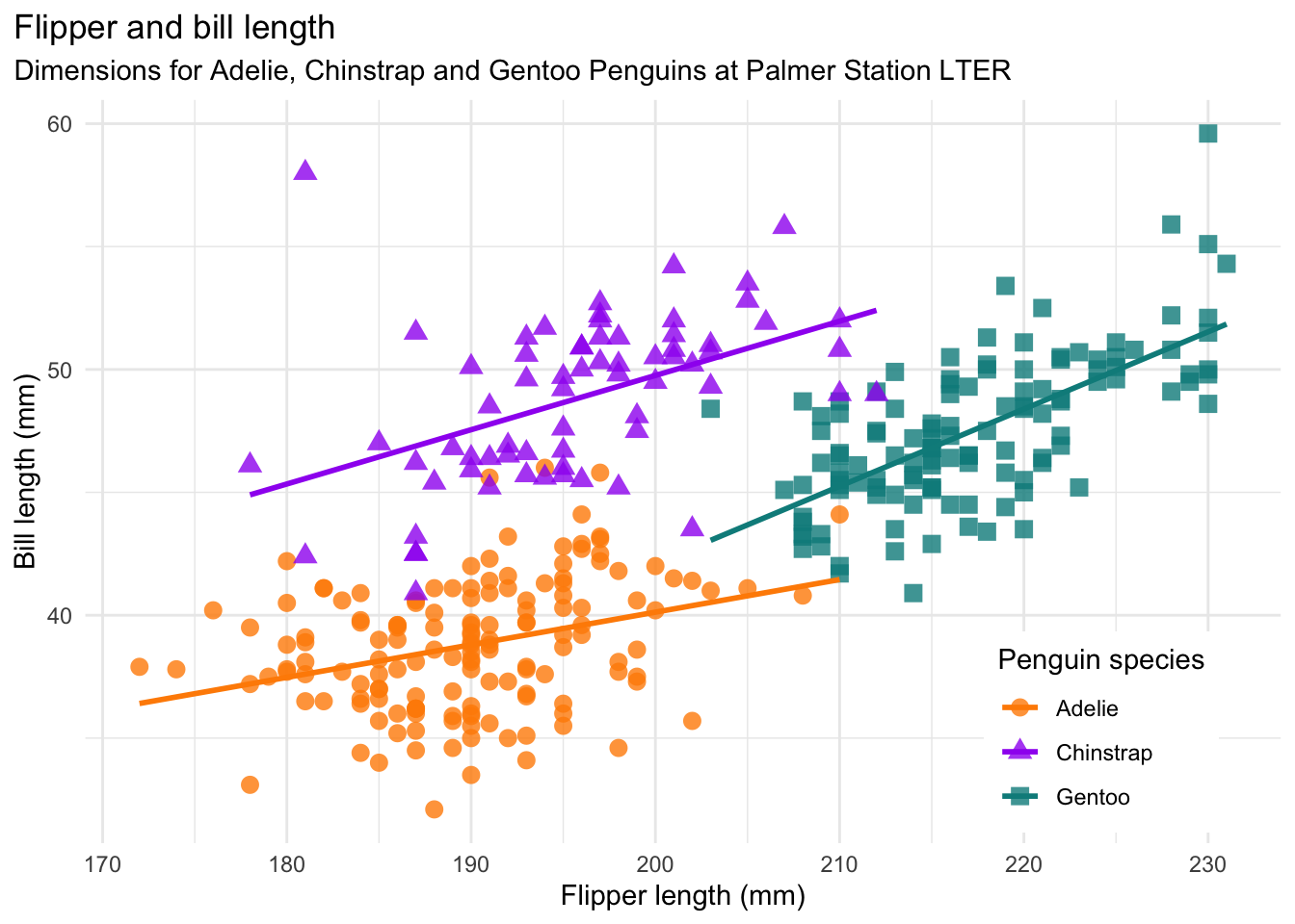
It is similar to the one from Task 1.3.1 but more beautiful. Can you reproduce this plot?
The colors that are used are:
2.2.9 Save one of the plots on your machine
Save one of the plots you produced in a variable and then use ggsave to save the plot on your machine. Save the plot in a dedicated plot directory in your RStudio project.
Note: Make sure the path where you save the image exists. If you e.g. want to save in img/, then you first have to create the img folder in your project directory. For this you can use the Files pane of RStudio.
2.2.10 References
Horst AM, Hill AP, Gorman KB (2020). palmerpenguins: Palmer Archipelago (Antarctica) penguin data. R package version 0.1.0. https://allisonhorst.github.io/palmerpenguins/. doi: 10.5281/zenodo.3960218.
2.3 dplyr - get started
A helpful resource for to consult for this task can be the dplyr cheatsheet.
Before you start, make sure to load dplyr, ggplot2 and the palmerpenguins package.
library(dplyr)
library(ggplot2)
library(palmerpenguins)
2.4 Data transformation with dplyr
In the following, you find a lot of different data transformation tasks. First, do 1-2 from each category before you do the remaining ones. You don’t have to finish all the tasks but make sure you covered each category. Generally, the first tasks from a category are easier than the last tasks of a category.
Find all penguins that …
… have a bill length between 40 and 45 mm.
… for which we know the sex.
… which are of the species Adelie or Gentoo and live either on Dream or on Torgersen
… lived on the island Dream in the year 2007. How many of them were from each of the 3 species?
Count …
… the number of penguins on each island.
… the number of penguins of each species on each island.
Select …
… only the variables species, sex and year
… variables based on the following vector
cols <- c("species", "bill_length_mm", "flipper_length_mm", "body_mass_g")- … only columns that contain measurements in mm
Add a column …
… with the ratio of bill length to bill depth
… with abbreviations for the species (Adelie = A, Gentoo = G, Chinstrap = C).
Calculate …
… mean flipper length and body mass for the 3 species and male and female penguins separately
… Can you do the same but remove the penguins for which we don’t know the sex first?
2.5 Extras
Make a boxplot of penguin body mass with sex on the x-axis and facets for the different species. Can you remove the penguins with missing values for sex first?
Make a scatterplot with the ratio of bill length to bill depth on the y axis and flipper length on the x axis? Can you distinguish the point between male and female penguins and remove penguins with unknown sex before making the plot?