library(readr)
library(dplyr)
library(ggplot2)
library(ggfortify)

## theme for ggplot
theme_set(theme_classic())
theme_update(text = element_text(size = 14))Solution to influence of temperature on species growth exercise
1 Load packages
2 Load data
df_growth <- read_csv("data/05_growth.csv")
df_growth
# A tibble: 100 × 6
temperature species1 species2 species3 species4 species5
<dbl> <dbl> <dbl> <dbl> <dbl> <dbl>
1 23.4 5.38 4.87 6.19 7.34 2.92
2 11.4 1.85 1.19 1.77 1.91 0.339
3 19.0 2.65 4.04 5.68 4.11 1.06
4 24.8 5.23 5.88 6.25 7.36 7.10
5 6.34 0.527 0.463 1.03 0.396 0.096
6 15.9 3.46 3.15 4.76 3.21 1.01
7 14.6 3.00 4.27 1.13 4.95 0.516
8 22.8 6 4.39 4.45 5.31 4.24
9 16.1 3.32 1.36 0.425 3.50 1.31
10 7.46 0.686 1.09 0.858 0.971 0.32
# ℹ 90 more rows2.1 Species 1
lm_species1 <- lm(species1 ~ temperature, data = df_growth)
autoplot(lm_species1, which = 1:2)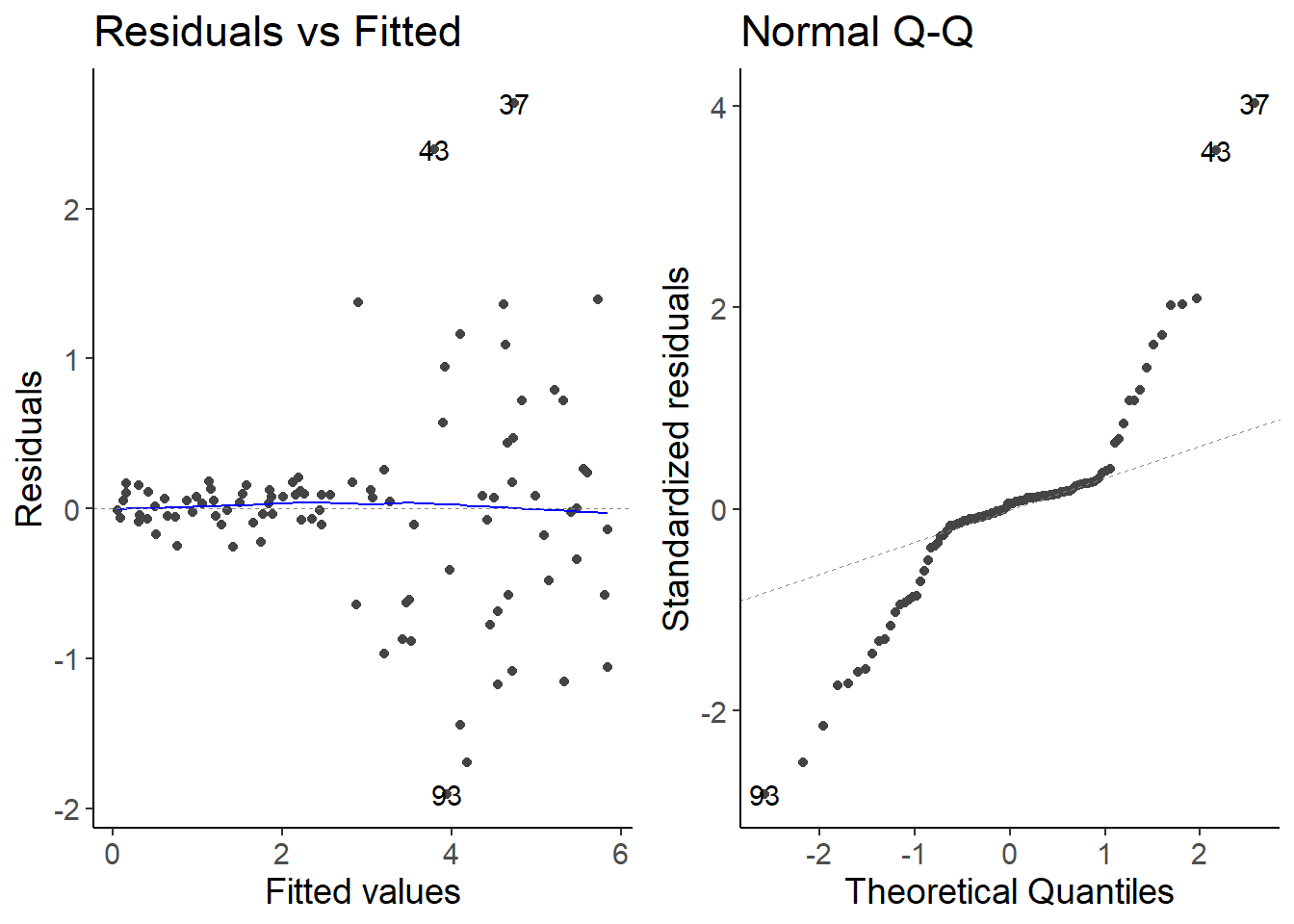
ggplot(df_growth, aes(temperature, species1)) +
    geom_point() +
    geom_abline(intercept = coef(lm_species1)[1],
                slope = coef(lm_species1)[2],
                color = "red", linewidth = 2,
                alpha = 0.5) +
    labs(y = "Netto primary production of species 1 [gCm⁻²day⁻¹]",
x = "Temperature [°C]") 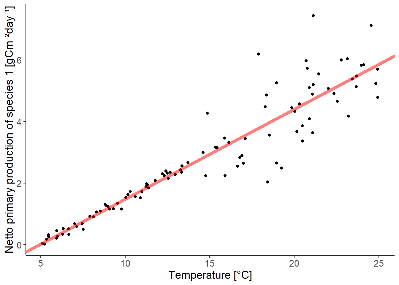
2.2 Species 2
lm_species2 <- lm(species2 ~ temperature, data = df_growth)
autoplot(lm_species2, which = 1:2)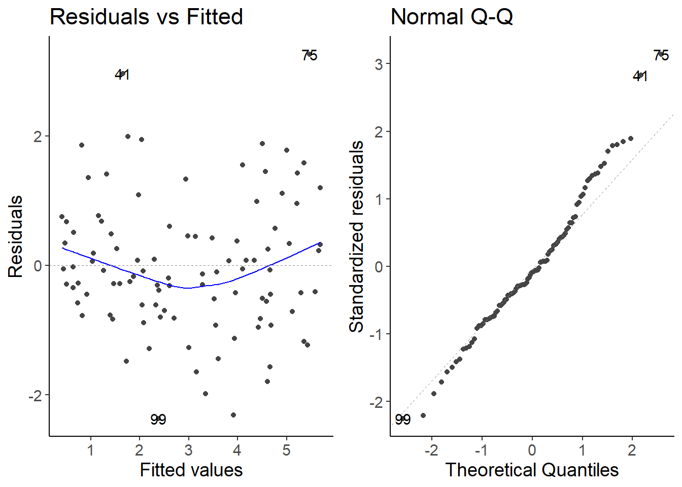
ggplot(df_growth, aes(temperature, species2)) +
    geom_point() +
    geom_abline(intercept = coef(lm_species2)[1],
                slope = coef(lm_species2)[2],
                color = "red", linewidth = 2,
                alpha = 0.5) +
    labs(y = "Netto primary production of species 2 [gCm⁻²day⁻¹]",
x = "Temperature [°C]") 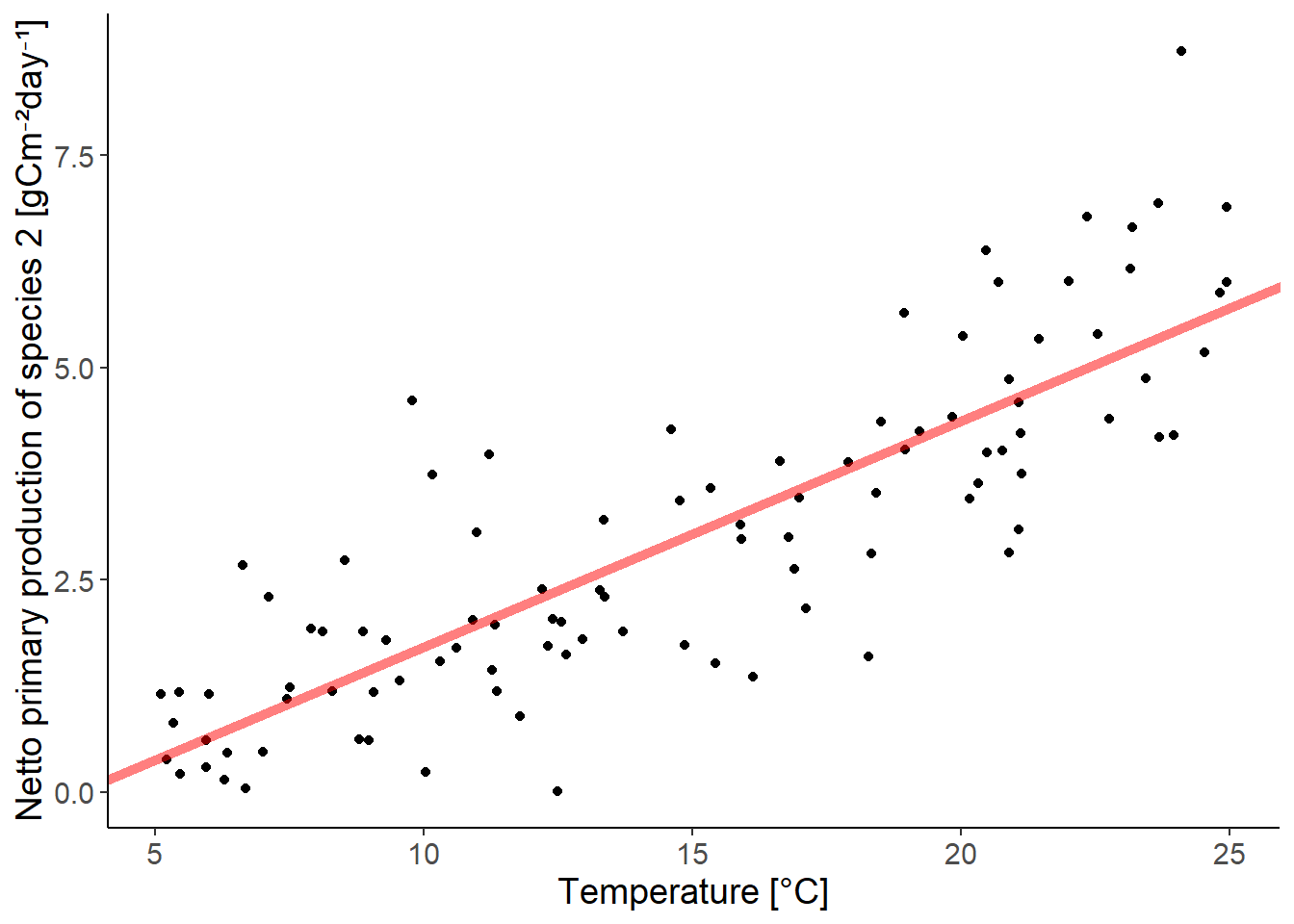
Everything is fine here, even if there seems to be a slight trend in the residuals.
2.3 Species 3
lm_species3 <- lm(species3 ~ temperature, data = df_growth)
autoplot(lm_species3, which = 1:2)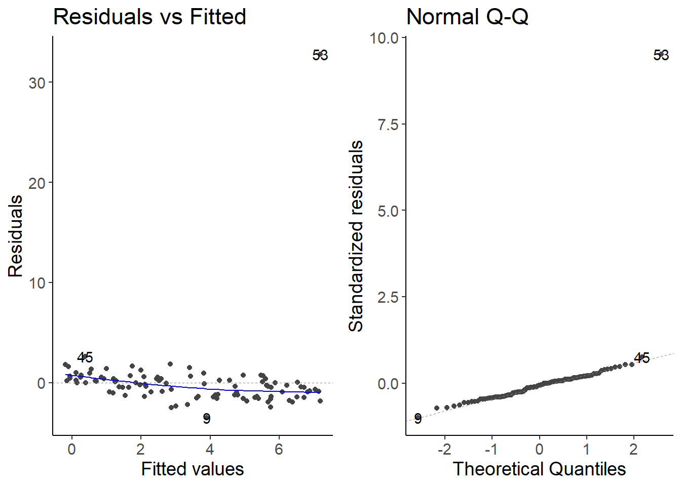
ggplot(df_growth, aes(temperature, species3)) +
    geom_point() +
    geom_abline(intercept = coef(lm_species3)[1],
                slope = coef(lm_species3)[2],
                color = "red", linewidth = 2,
                alpha = 0.5) +
    labs(y = "Netto primary production of species 3 [gCm⁻²day⁻¹]",
x = "Temperature [°C]") 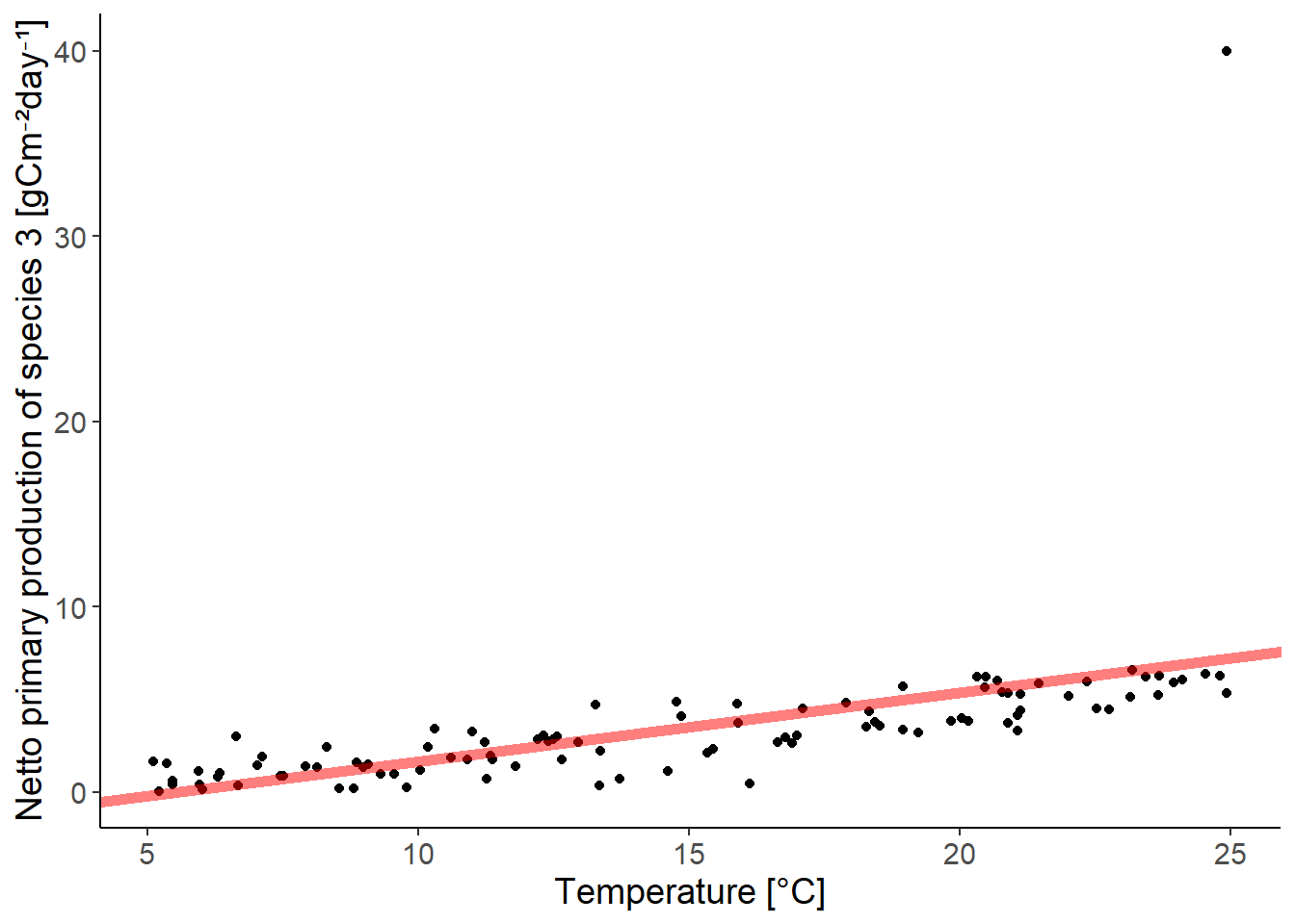
There is one outlier. You should check if you mistyped the value or if it is a real outlier. If you remove it because you think you made a mistake, you should be transparent about it.
2.4 Species 4
lm_species4 <- lm(species4 ~ temperature, data = df_growth)
autoplot(lm_species4, which = 1:2)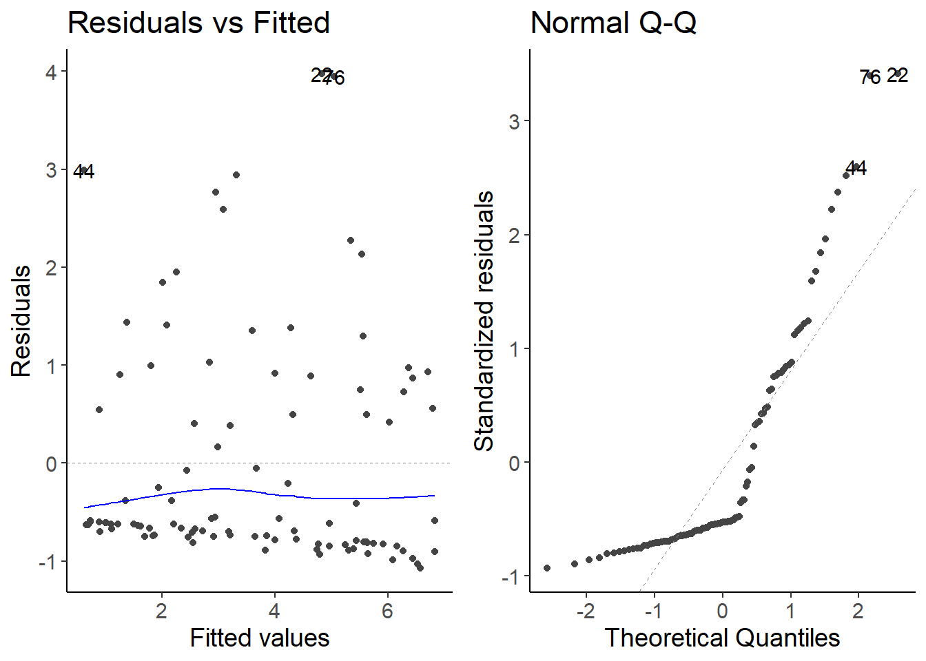
ggplot(df_growth, aes(temperature, species4)) +
    geom_point() +
    geom_abline(intercept = coef(lm_species4)[1],
                slope = coef(lm_species4)[2],
                color = "red", linewidth = 2,
                alpha = 0.5) +
    labs(y = "Netto primary production of species 4 [gCm⁻²day⁻¹]",
x = "Temperature [°C]") 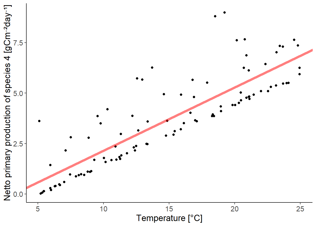
The residuals do not follow a Normal distribution. The residuals are skewed to the right.
2.5 Species 5
lm_species5 <- lm(species5 ~ temperature, data = df_growth)
autoplot(lm_species5, which = 1:2)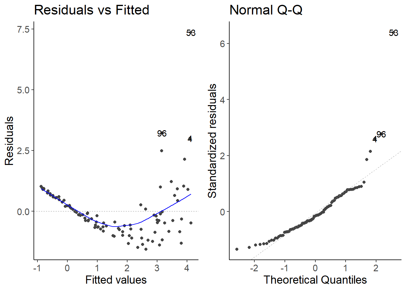
ggplot(df_growth, aes(temperature, species5)) +
    geom_point() +
    geom_abline(intercept = coef(lm_species5)[1],
                slope = coef(lm_species5)[2],
                color = "red", linewidth = 2,
                alpha = 0.5) +
    labs(y = "Netto primary production of species 5 [gCm⁻²day⁻¹]",
x = "Temperature [°C]") 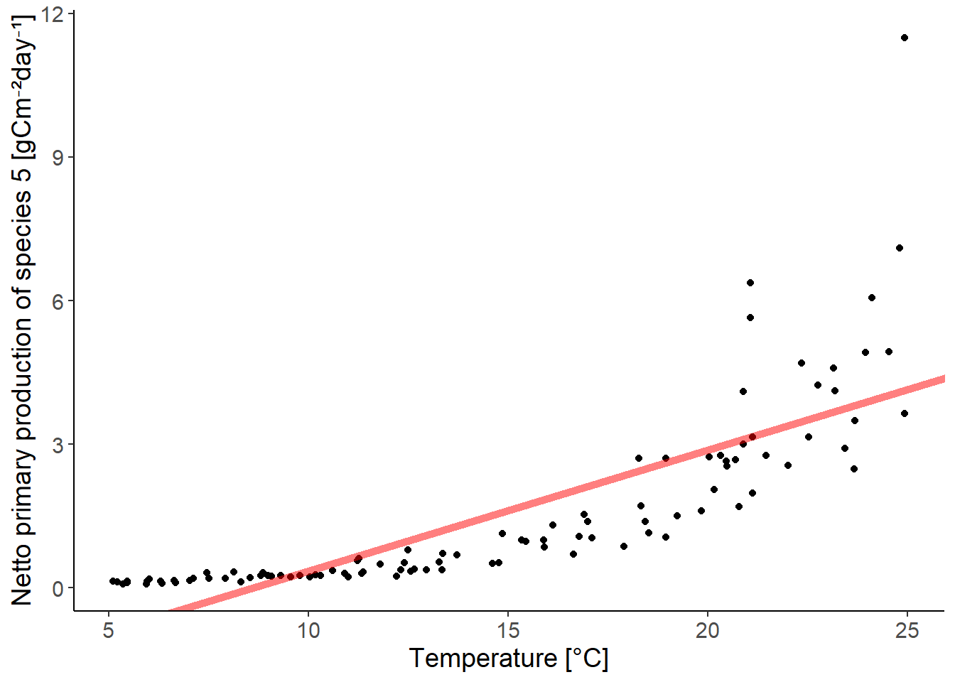
The relationship between the predictor and the response variable is not linear. There is an exponential relationship. We can transform the response variable to fit an exponential equation.