library(readr)
library(ggplot2)
library(dplyr)
library(tidyr)
library(forcats)

## theme for ggplot
theme_set(theme_classic())
theme_update(text = element_text(size = 14))

specdat <- read_csv("data/08_species.csv")
specdat <- specdat %>%
mutate(pH = fct_relevel(pH, "low", "mid", "high"))Solution for GLM predictions at the link scale
1 Solution with R output
First, we read the data and adjust it in the same way as in the lecture.
Now, we can fit the model including the interaction
mod1 <- glm(Species ~ Biomass * pH, data = specdat,
            family = "poisson")
As next step, we prepare new data and use it to predict species richness. First, at the response-scale as in the lecture, and second, at the scale of the log-link function. Note the use of the argument type in the predict() function.
pred_dat <- expand_grid(Biomass = seq(min(specdat$Biomass),
                                      max(specdat$Biomass),
                                      length = 200),
                        pH      = unique(specdat$pH))

# Add predictions at the response scale (as in the lecture)
pred_dat$y_response <- predict(mod1, newdata = pred_dat, type = "response")

# Add predictions at the link scale
pred_dat$y_link     <- predict(mod1, newdata = pred_dat, type = "link")
When we want to plot the data and the predictions at the link function scale together, we also need to apply the log-link function to the data.
ggplot(specdat, aes(Biomass, log(Species), color = pH)) +
  geom_point() +
  geom_line(aes(Biomass, y_link), data = pred_dat)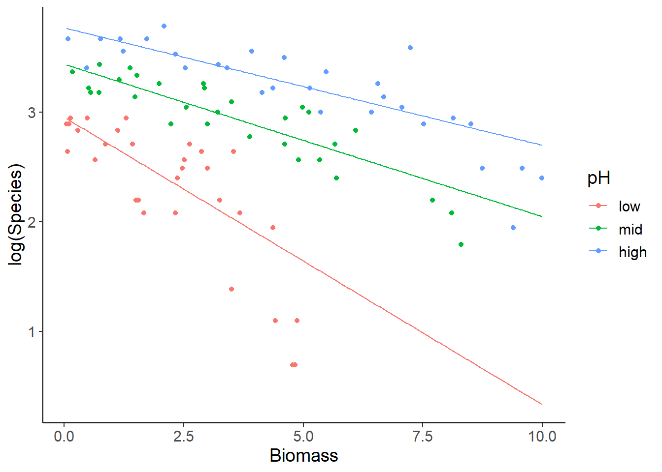
An alternative solution is to keep data and predictions at the response-scale, but use a log-transformed y-axis instead. Note the different tick labels in the last plot and in the following one!
ggplot(specdat, aes(Biomass, Species, color = pH)) +
  geom_point() +
  geom_line(aes(Biomass, y_response), data = pred_dat) +
  scale_y_log10()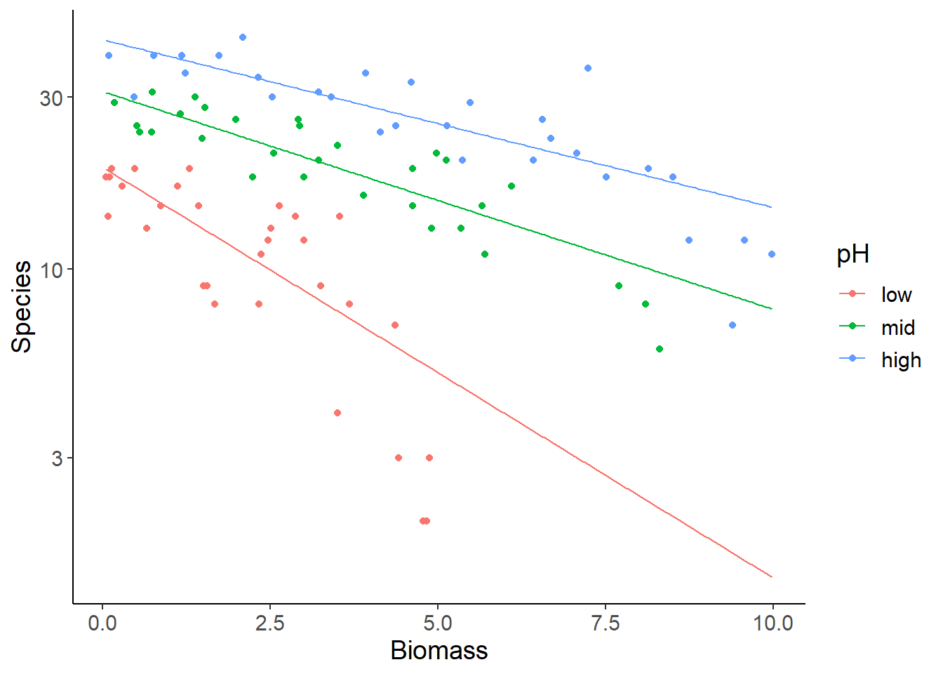
The advantage of these plots is that you can use the graphical interpretation of non-parallel vs. parallel regression lines for the levels of the categorical variable (pH) as evidence for or against an interaction effect. Here you see that the slope for low pH is steeper than for the other two groups, which is reflected in the significant interaction. The disadvantage is that you cannot directly read intuitive values for species richness from the y-axis, because of the log-scaling.
drop1(mod1, test = "Chi")Single term deletions
Model:
Species ~ Biomass * pH
Df Deviance AIC LRT Pr(>Chi)
<none> 83.201 514.39
Biomass:pH 2 99.242 526.43 16.04 0.0003288 ***
---
Signif. codes: 0 '***' 0.001 '**' 0.01 '*' 0.05 '.' 0.1 ' ' 12 Solution as one script without output
library(readr)
library(ggplot2)
library(dplyr)
library(tidyr)
library(forcats)

# Load and adjust the data as in the lecture
specdat <- read_csv("data/08_species.csv")
specdat <- specdat %>%
  mutate(pH = fct_relevel(pH, "low", "mid", "high"))

# Fit full model with interaction
mod1 <- glm(Species ~ Biomass * pH, data = specdat,
            family = "poisson")

# Prepare new data for predictions
pred_dat <- expand_grid(Biomass = seq(min(specdat$Biomass),
                                      max(specdat$Biomass),
                                      length = 200),
                        pH      = unique(specdat$pH))

# Add predictions at the response scale (as in the lecture)
pred_dat$y_response <- predict(mod1, newdata = pred_dat, type = "response")

# Add predictions at the link scale
pred_dat$y_link     <- predict(mod1, newdata = pred_dat, type = "link")

# Create plot with log-transformed species richness
ggplot(specdat, aes(Biomass, log(Species), color = pH)) +
  geom_point() +
  geom_line(aes(Biomass, y_link), data = pred_dat)

# Alternatively, you can plot data and predictions at the response scale
# and just log-transform the y-axis.
ggplot(specdat, aes(Biomass, Species, color = pH)) +
  geom_point() +
  geom_line(aes(Biomass, y_response), data = pred_dat) +
  scale_y_log10()