library(readr)
library(ggplot2)
library(dplyr)
library(tidyr)

## theme for ggplot
theme_set(theme_classic())
theme_update(text = element_text(size = 14))Solution for exercise on plant species richness in fragmented landscapes
1 Preparations
- Loading required packages and set ggplot theme.
2 Read the data
dat1 <- read_csv("data/09_dataset1_spec_frag.csv")
dat1
# A tibble: 33 × 3
species_richness area_ha nn_dist_m
<dbl> <dbl> <dbl>
1 17 98.1 749
2 2 29.3 878
3 12 54.6 365
4 14 21.3 27
5 15 78.8 801
6 26 50.4 193
7 26 78.1 627
8 18 4 113
9 36 70.4 284
10 22 36.1 159
# ℹ 23 more rows3 Graphical data exploration
- Area at the x-axis, colour indicates isolation:
ggplot(dat1, aes(area_ha, species_richness, color = nn_dist_m)) +
  geom_point(size = 3) +
  scale_color_viridis_c()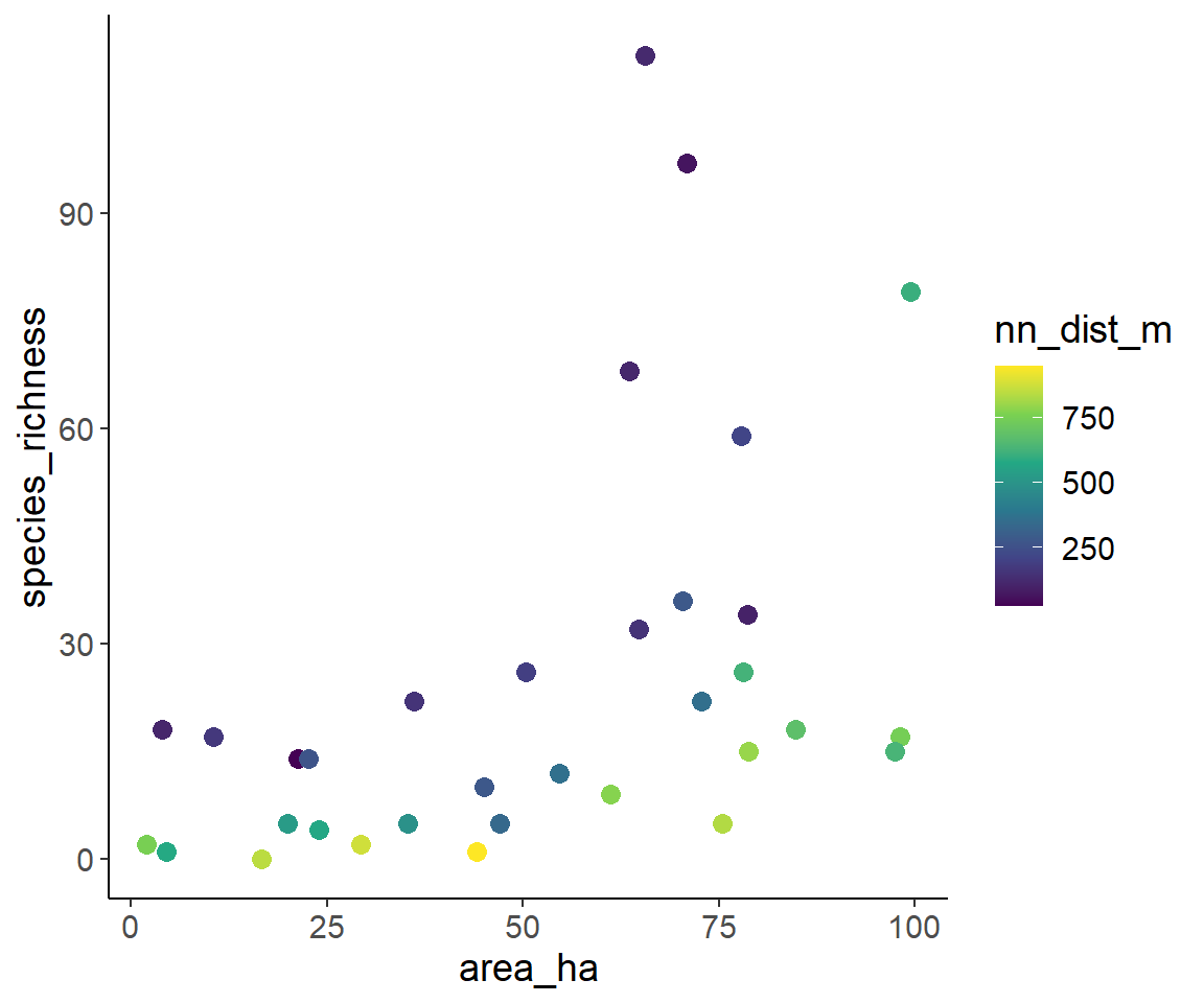
- Isolation at the x-axis, color indicates area
ggplot(dat1, aes(nn_dist_m, species_richness, color = area_ha)) +
  geom_point(size = 3) +
  scale_color_viridis_c()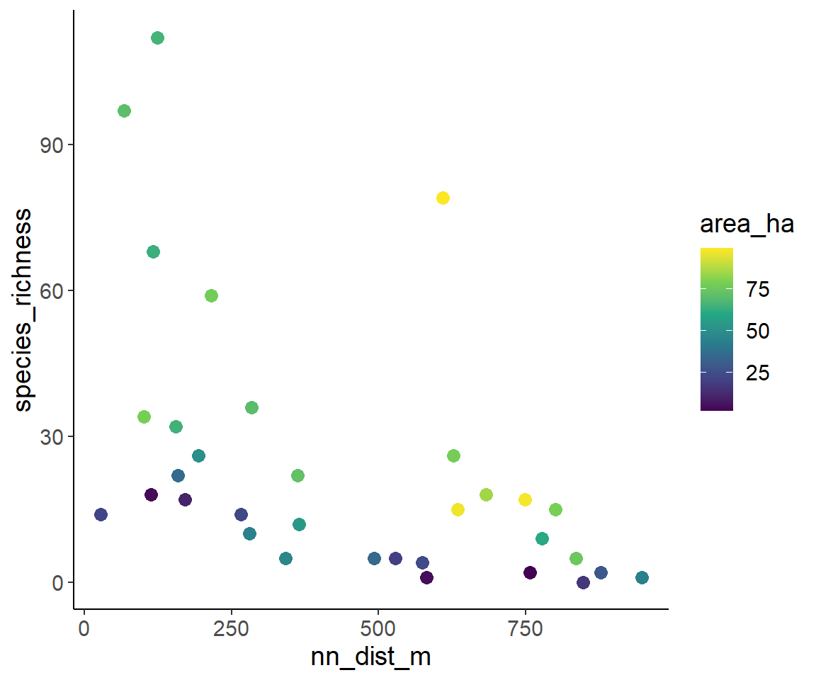
From these plots, we can “guesstimate” that species richness increases with fragment area and decreases with fragment isolation. This is in line with the expectation from the Theory of Island Biogeography and from metapopulation ecology.
4 Statistical modelling
4.1 Fitting the first model
Species richness is a count, so we choose a GLM with Poisson error and log-link.
glm1 <- glm(species_richness ~ area_ha * nn_dist_m, family = "poisson",
            data = dat1)
summary(glm1)
Call:
glm(formula = species_richness ~ area_ha * nn_dist_m, family = "poisson",
    data = dat1)

Coefficients:
                    Estimate Std. Error z value Pr(>|z|)
(Intercept)        2.997e+00  1.838e-01  16.309  < 2e-16 ***
area_ha            2.163e-02  2.765e-03   7.821 5.24e-15 ***
nn_dist_m         -4.812e-03  5.766e-04  -8.346  < 2e-16 ***
area_ha:nn_dist_m  2.480e-05  7.231e-06   3.430 0.000603 ***
---
Signif. codes:  0 '***' 0.001 '**' 0.01 '*' 0.05 '.' 0.1 ' ' 1

(Dispersion parameter for poisson family taken to be 1)

    Null deviance: 839.84  on 32  degrees of freedom
Residual deviance: 194.43  on 29  degrees of freedom
AIC: 345.66

Number of Fisher Scoring iterations: 4
Note the clear overdispersion: 128.18/29 = 4.42! To account for overdispersion, I show two approaches here.
In your reports it is completely fine, when you just use one of the approaches in case of overdispersion!
4.2 Approach 1: GLM with negative binomial error and log-link
library(MASS)
glm1_nb <- glm.nb(species_richness ~ area_ha*nn_dist_m,
               data = dat1)
summary(glm1_nb)
Call:
glm.nb(formula = species_richness ~ area_ha * nn_dist_m, data = dat1,
    init.theta = 5.718309368, link = log)

Coefficients:
                    Estimate Std. Error z value Pr(>|z|)
(Intercept)        2.976e+00  3.684e-01   8.078 6.56e-16 ***
area_ha            2.128e-02  6.379e-03   3.336 0.000848 ***
nn_dist_m         -4.390e-03  8.741e-04  -5.022 5.11e-07 ***
area_ha:nn_dist_m  2.036e-05  1.308e-05   1.556 0.119692
---
Signif. codes:  0 '***' 0.001 '**' 0.01 '*' 0.05 '.' 0.1 ' ' 1

(Dispersion parameter for Negative Binomial(5.7183) family taken to be 1)

    Null deviance: 175.719  on 32  degrees of freedom
Residual deviance:  30.956  on 29  degrees of freedom
AIC: 228.5

Number of Fisher Scoring iterations: 1

              Theta:  5.72
          Std. Err.:  1.83

 2 x log-likelihood:  -218.505
The negative binomial model appropriately accounts for the overdispersion.
Next, I test the interaction effect:
test_interaction_nb <- drop1(glm1_nb, test = "Chi")
test_interaction_nb
Single term deletions
Model:
species_richness ~ area_ha * nn_dist_m
Df Deviance AIC LRT Pr(>Chi)
<none> 30.956 226.50
area_ha:nn_dist_m 1 33.405 226.95 2.4492 0.1176There is no evidence for a significant interaction effect. Accordingly, I also fit a model with the two main effects only
glm2_nb <- glm.nb(species_richness ~ area_ha + nn_dist_m,
               data = dat1)
test_main_nb <- drop1(glm2_nb, test = "Chi")
test_main_nb
Single term deletions
Model:
species_richness ~ area_ha + nn_dist_m
Df Deviance AIC LRT Pr(>Chi)
<none> 31.59 226.89
area_ha 1 111.55 304.86 79.962 < 2.2e-16 ***
nn_dist_m 1 115.03 308.34 83.443 < 2.2e-16 ***
---
Signif. codes: 0 '***' 0.001 '**' 0.01 '*' 0.05 '.' 0.1 ' ' 1Both main effects are clearly significant!
4.3 Approach 2: Quasipoisson-GLM
glm1_qp <- glm(species_richness ~ area_ha * nn_dist_m, family = "quasipoisson", data = dat1)
summary(glm1_qp)
Call:
glm(formula = species_richness ~ area_ha * nn_dist_m, family = "quasipoisson",
    data = dat1)

Coefficients:
                    Estimate Std. Error t value Pr(>|t|)
(Intercept)        2.997e+00  4.810e-01   6.231 8.48e-07 ***
area_ha            2.163e-02  7.238e-03   2.988  0.00567 **
nn_dist_m         -4.812e-03  1.509e-03  -3.188  0.00342 **
area_ha:nn_dist_m  2.480e-05  1.893e-05   1.311  0.20030
---
Signif. codes:  0 '***' 0.001 '**' 0.01 '*' 0.05 '.' 0.1 ' ' 1

(Dispersion parameter for quasipoisson family taken to be 6.851746)

    Null deviance: 839.84  on 32  degrees of freedom
Residual deviance: 194.43  on 29  degrees of freedom
AIC: NA

Number of Fisher Scoring iterations: 4
Note the change in the dispersion parameter compared to the normal Poisson-GLM
test_interaction_qp <- drop1(glm1_qp, test = "F")
test_interaction_qp
Single term deletions
Model:
species_richness ~ area_ha * nn_dist_m
Df Deviance F value Pr(>F)
<none> 194.43
area_ha:nn_dist_m 1 206.56 1.8096 0.189Note the use of the F-distribution instead of the the Chi2-distribution!
Again no indication of significant interaction!
glm2_qp <- glm(species_richness ~ area_ha + nn_dist_m, family = "quasipoisson", data = dat1)
test_main_qp <- drop1(glm2_qp, test = "F")
Again, both main effects clearly significant.
4.4 P-value adjustment because of multiple testing
For each model approach, I did three tests with the same data. Therefore, I should adjust the p-values to fix the overall type I error rate (for all three tests together) at 0.05. This is shown here using the tests with the quasipoisson-model
To see, how I can extract the p-values from the results of drop1(), the str() function is very useful to explore the internal structure of and R-object
str(test_main_qp)Classes 'anova' and 'data.frame': 3 obs. of 4 variables:
$ Df : num NA 1 1
$ Deviance: num 207 559 610
$ F value : num NA 51.2 58.7
$ Pr(>F) : num NA 5.80e-08 1.53e-08
- attr(*, "heading")= chr [1:3] "Single term deletions" "\nModel:" "species_richness ~ area_ha + nn_dist_m"The p-values are included in column 4 named Pr(>F)
test_main_qp$`Pr(>F)`[1] NA 5.802116e-08 1.527647e-08Obviously, the first value is NA here. So I can put all 3 p-values in one vector in the following way:
p_vals <- c(test_interaction_qp$`Pr(>F)`[2], test_main_qp$`Pr(>F)`[2:3])
p_vals
[1] 1.889762e-01 5.802116e-08 1.527647e-08And now, I can adjust them for multiple testing using Holm’s method:
p.adjust(p_vals, method = "holm")[1] 1.889762e-01 1.160423e-07 4.582941e-08Given the clear results before and the low number of just three test, this does of course not change our findings.
5 Create and plot predictions
5.1 One variable at a time
Because, we did not find evidence for an interaction, it is appropriate to visualize the effects of the variables independently. For this purpose, I vary one variable at a time and fix the other one at its observed mean.
5.1.1 Area varies, isolation at its mean
- Generate new data for predictions
min_area <- min(dat1$area_ha)
max_area <- max(dat1$area_ha)

pred_dat_area <- tibble(area_ha = seq(min_area, max_area, length = 100),
nn_dist_m = mean(dat1$nn_dist_m))- Add predictions with one column for each model
pred_dat_area <- pred_dat_area %>%
  mutate(neg_binom     = predict(glm2_nb, newdata = ., type = "response"),
         quasi_poisson = predict(glm2_qp, newdata = ., type = "response")
         )
pred_dat_area
# A tibble: 100 × 4
area_ha nn_dist_m neg_binom quasi_poisson
<dbl> <dbl> <dbl> <dbl>
1 2 444. 3.24 3.34
2 2.98 444. 3.34 3.44
3 3.97 444. 3.44 3.54
4 4.95 444. 3.54 3.64
5 5.94 444. 3.64 3.75
6 6.92 444. 3.75 3.86
7 7.90 444. 3.86 3.97
8 8.89 444. 3.97 4.09
9 9.87 444. 4.09 4.21
10 10.9 444. 4.21 4.34
# ℹ 90 more rowsIn this table, we have two columns for the predictions, but for easier plotting with ggplot() it is helpful, when all predictions are on one column and the model type is a new column. This can be achieved with pivot_longer() from the tidyr package:
pred_dat_area_long <- pred_dat_area %>%
  pivot_longer(neg_binom:quasi_poisson, names_to = "model_type", values_to = "species_richness")
Now, we can nicely plot the predictions of both models
ggplot(dat1, aes(area_ha, species_richness)) +
  geom_point() +
  geom_line(aes(color = model_type), data = pred_dat_area_long)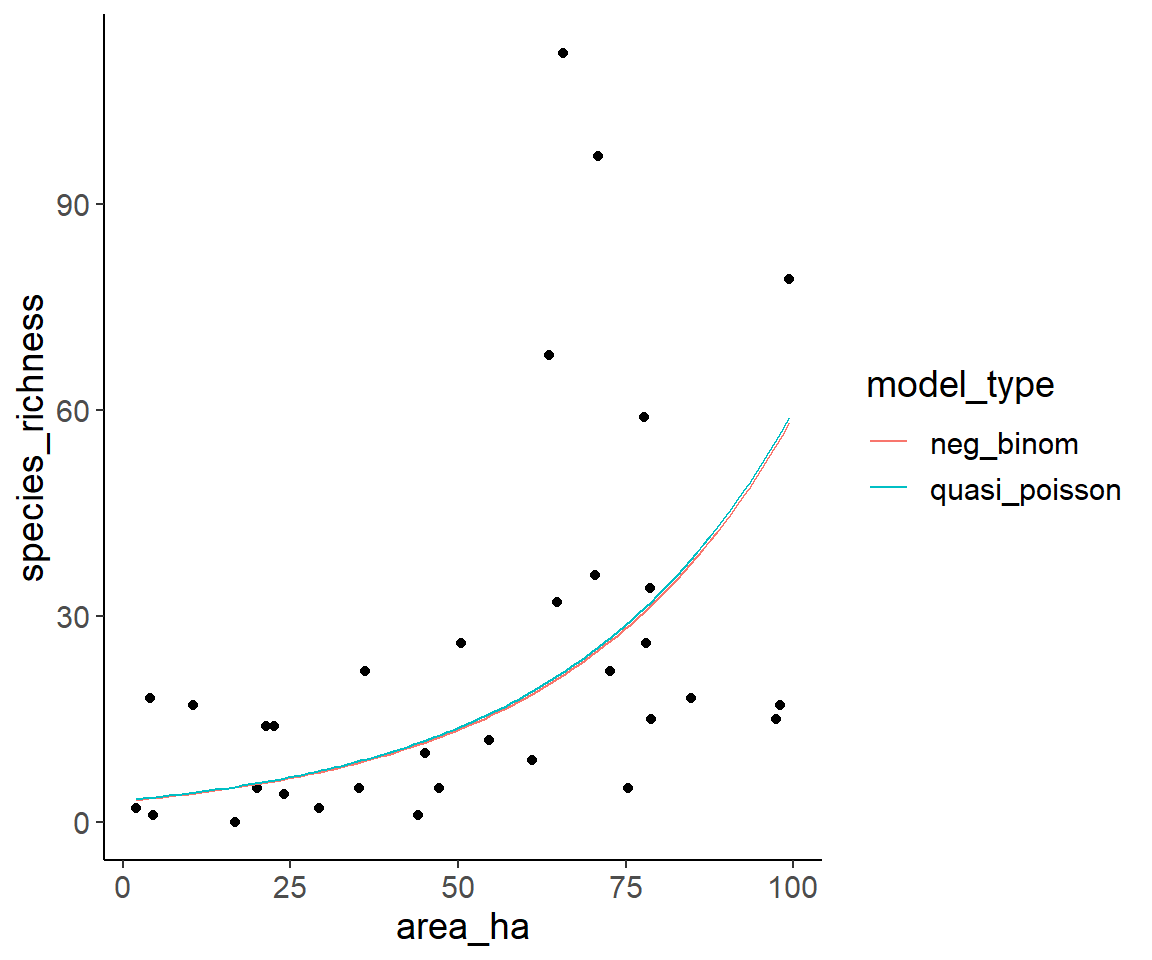
Obviously, the predictions of both models are extremely similar.
5.1.2 Isolation varies, area at its mean
Now, we do the same just with area and isolation swapped:
min_nn_dist <- min(dat1$nn_dist_m)
max_nn_dist <- max(dat1$nn_dist_m)

pred_dat_nn_dist <- tibble(area_ha   = mean(dat1$area_ha),
                           nn_dist_m = seq(min_nn_dist, max_nn_dist, length = 100))

pred_dat_nn_dist <- pred_dat_nn_dist %>%
  mutate(neg_binom     = predict(glm2_nb, newdata = ., type = "response"),
         quasi_poisson = predict(glm2_qp, newdata = ., type = "response")
         )

pred_dat_nn_dist_long <- pred_dat_nn_dist %>%
  pivot_longer(neg_binom:quasi_poisson, names_to = "model_type", values_to = "species_richness")

ggplot(dat1, aes(nn_dist_m, species_richness)) +
  geom_point() +
  geom_line(aes(color = model_type), data = pred_dat_nn_dist_long)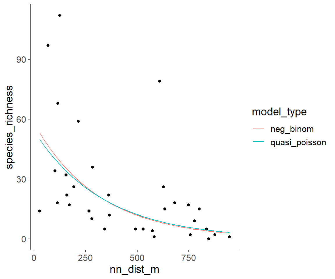
5.2 Visualize variations of two variables at the same time
5.2.1 Pseudo-3D plots
One option to visualize the effect of area and isolation on species richness at the same time are plots where each axis shows one of the explanatory variables and the species richness is indicated by colour.
For this purpose, I first generate a grid with many combinations of area and isolation for which predictions are generated. Here, I only use the model with the negative-binomial distributions, but it will work with the quasipoisson model in the same way.
pred_data <- expand_grid(
  area_ha = seq(min_area, max_area, length = 100),
  nn_dist_m = seq(min_nn_dist, max_nn_dist, length = 100)
)

pred_data$pred_spec_rich <- predict(glm2_nb, newdata = pred_data, type = "response")
One option for such a plot is a raster plot:
ggplot(pred_data, aes(area_ha, nn_dist_m)) +
  geom_raster(aes(fill = pred_spec_rich)) +
  scale_fill_viridis_c()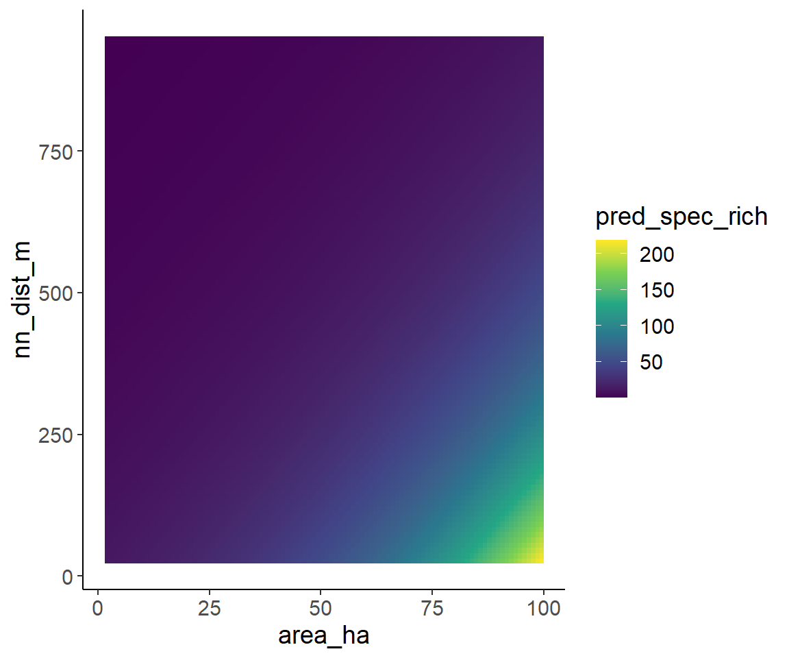
A second option is a filled contour plot, which is similar to topographical with lines indicating the elevation.
ggplot(pred_data, aes(area_ha, nn_dist_m)) +
  geom_contour_filled(aes(z = pred_spec_rich))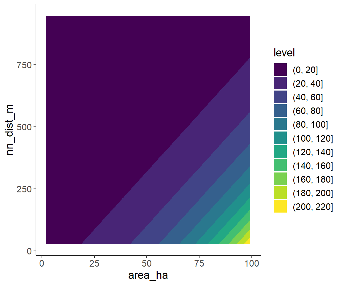
In the filled contour plot and interaction would be indicated by non-linear contour lines. Since the model does not include an interaction, this is not the case here.
5.2.2 One variable as x-axis, the second one with several discrete values
Another idea is to put on variable on the x-axis and plot several lines for discrete values of the other one.
Here, I plot area on the x-axis and draw five lines for the 5%, 25%, 50% (=median), 75% and 95% quantiles of the isolation. These quantiles are similar to the values shown in a boxplot, just use the 5% quantile instead of the minimum and the 95% quantile instead of the maximum to avoid extreme values.
pred_data <- expand_grid(
  area_ha = seq(min_area, max_area, length = 100),
  nn_dist_m = quantile(dat1$nn_dist_m, probs = c(0.05, 0.25, 0.5, 0.75, 0.95))
)

pred_data$pred_spec_rich <- predict(glm2_nb, newdata = pred_data, type = "response")

ggplot(dat1, aes(area_ha, species_richness)) +
  geom_point() +
  geom_line(aes(y = pred_spec_rich, color = nn_dist_m, group = nn_dist_m), data = pred_data) +
  scale_color_viridis_c()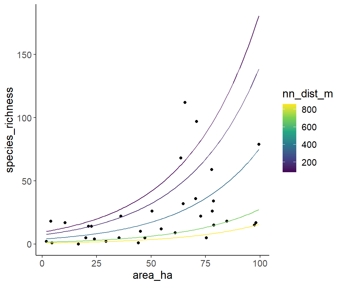
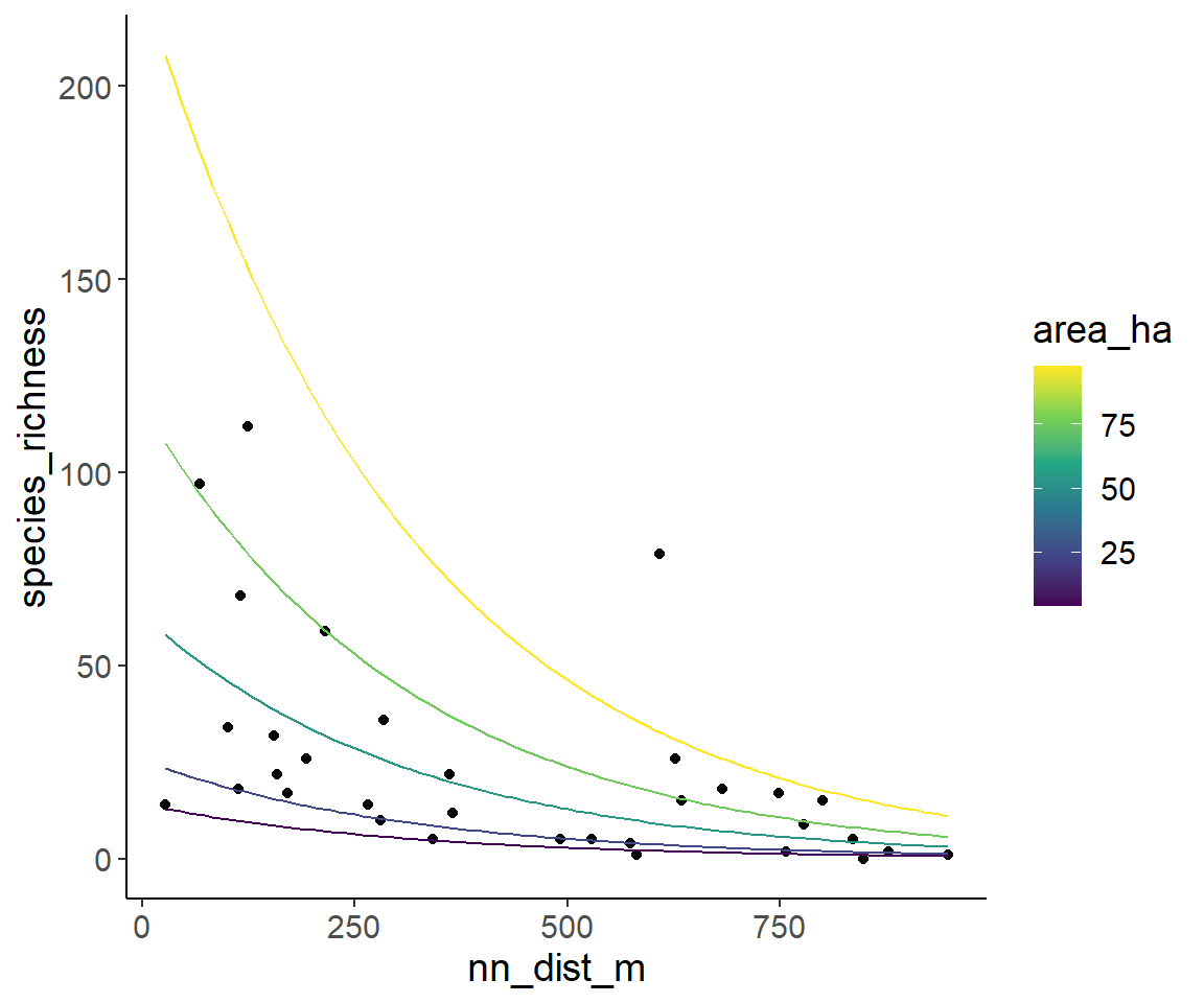
And finally, the same is down with isolation on the x-axis and several lines for several areas.
pred_data <- expand_grid(
  area_ha =  quantile(dat1$area_ha, probs = c(0.05, 0.25, 0.5, 0.75, 0.95)),
  nn_dist_m = seq(min_nn_dist, max_nn_dist, length = 100)
)

pred_data$pred_spec_rich <- predict(glm2_nb, newdata = pred_data, type = "response")

ggplot(dat1, aes(nn_dist_m, species_richness)) +
  geom_point() +
  geom_line(aes(y = pred_spec_rich, color = area_ha, group = area_ha), data = pred_data) +
  scale_color_viridis_c()